Waterfall charts are great but they show a timeline rather than the relationships between the resources on a page and I often want to understand what triggered a resource to load.
At Velocity EU, Rajiv Vijayakumar of Qualcomm demonstrated a tool they're building to map the resource dependencies in webpages highlighting blocking paths etc.
Currently it's not clear whether Qualcomm are going to opensource the tool, or run it as a service (like WebPageTest), so during a moment of curiosity I attempted to produce something similar using WebKit dev tools and Mike Bostock's D3.js.
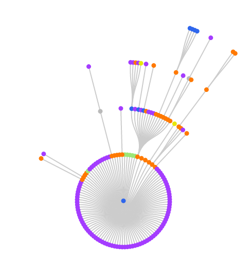
The results are interesting but unfortunately not quite right, as this chart for The Guardian demonstrates:

The green nodes in the above chart are CSS files which include some definitions with background images but you might notice there's no images (purple nodes) linked to them.
This is due to Chrome reporting the initiator as the HTML line that uses the selector and so triggers the download e.g. in the example below the a element would be reported as the initiator.
#logo { background: url('/content/images/web/logo.png')' }<a href="/" title="Logo" id="logo">Logo</a>Marco Tolk has found other scenarios where Chrome reports the initiator incorrectly so we're putting together a set of test cases to determine what works and what doesn't (for our needs).
I've got lots of ideas on how the charts could be enhanced but I'm holding off until the data is right, in the meantime I'm back in C++ land debugging and exploring what information Chrome can give me.
If you want to try it out for yourself the code I used to generate the charts is on GitHub.